Trending Searches:
Popular Movies:
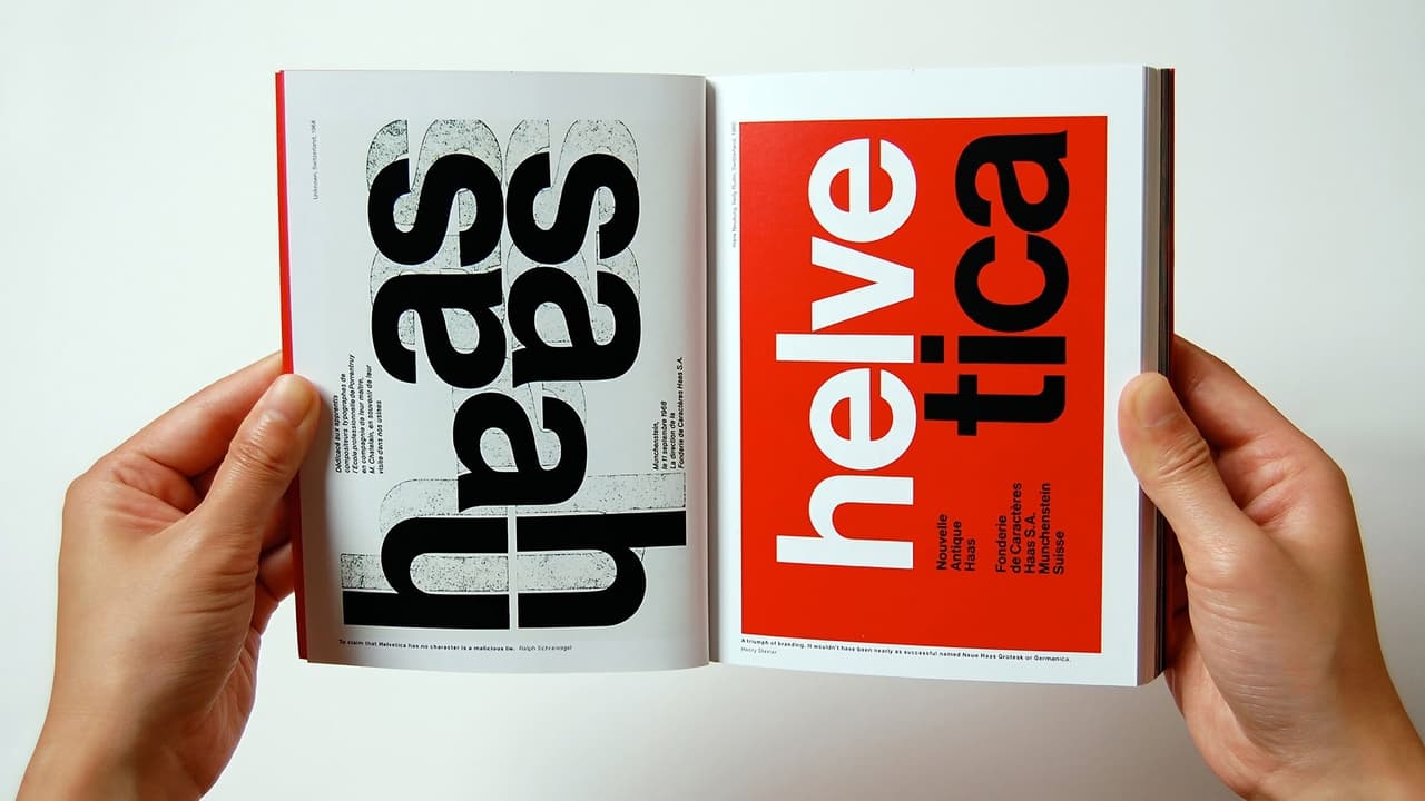

The maker wanted to so something new, something different. And it is so nice that the employer allowed this experiment. And that is about it.Maybe if the whole thing would have been 20-35 minutes long it would have been wonderful. But there is way too much space filler. So either that is bad planning by shooting too little or somebody was too attached to the footage that nothing could be dumped.Amusingly the story has no apparent structure, yet there is a clear and conventional ending. And the interviews seem to be thrown in as some of the speakers are against Helvetica usage, while most are in favor, but the selection criteria is not obvious to me.One argument this is plain bad work: there is a lot of talk of design, yet there are lots of pictures sliding in with logos written in Helvetica. This all looks like a silly advert from the 1980s. The purpose seems to be something along the lines of "you have to be initiated in order to see it".Still, I had a good laugh with the German designer calling the Swiss militarists (german joke, I know) and telling with a straight face how he is always late, one year late, but to the second.Bottom line: if you are curious about Helvetica and have two hours to waste, knock yourself out. Otherwise, this is a total waste of time.Contact me with Questions, Comments or Suggestions ryitfork @ bitmail.ch
... View MoreI have some writing background in the music press. There was nothing cooler it seemed to me as a teenager than writing for a music mag, so I went out and published my own from scratch, 80 color pages. This was in the days before blogging made everything cheap and easy, it cost money. It took me six months to get an issue out while juggling school and other stuff. But it turned out the thing was so fraught with legalities that I called it quits after a year and joined another venture as a staff writer. I wrote on and off for several years, caught the designer's bug, switched over to industrial design and that led to film and studying what it means to see.Anyway, one of the very first decisions in that trade is choosing the typeface. It has to be smart but readable and preferably communicate some identity. I was mostly clueless at the time, a lot of Impact and Papyrus for headlines. But I was drawn to Arial for the body, Microsoft's rather tasteless clone of Helvetica.They're not lying when they say Helvetica is everywhere. Chances are something was advertised to you in Helvetica today. Hell, you're reading this in Helvetica. There's a reason for this. It is its own composed aesthetic, and for a lot of people, you are the context you have paid to buy together with the trinket.So here's a very neat idea for a documentary; a look into the forms we use to build the context, skin and identity of our world.The guy responsible for this gets more in the way than illuminates. He spreads rather than delves, main concerns being generally about visual culture. We get various points of view, some of them insightful, some superficial.But another angle to consider is this. We have this new radical typeface invented to do away with the clutter of history and reflect a modern world. It is clean, blends perfectly, fits every use, in fact it is so empty of an idiosyncratic self it becomes what it means, we're led to think. The exciting thing born from idealism is soon used to sell things, how it happens most of the time.So we have subsequent generations of designers who consciously revolt against the culture that has appropriated the form by revolting against the form itself. They value individualism and expression above meaning. When they're done by the early 90's, design is a jumbled heap of grunge, post-modern attitudes lying on the floor in meaningless pieces - this is where I found it.But there is an old Dutch guy from that school of modernists that were creative at around the same time as Antonioni and others. It is not about the symmetry of form, he says, it is how you handle intermediate space, the emptiness around the thing. The breath of air that holds it together - aspiring filmmakers should take notice.Herzog could spin this more powerfully to be about the emptiness behind the signs we devise to navigate the world, designed to reflect being and order, beauty out of chaos, probably via eccentricity.Perhaps the typeface itself reveals as much. The tremendous success of Helvetica is a form that has been shaped to give the impression that it has sprung naturally from the sign. It eludes by the anonymity of pure function. Selflessness is its beauty.Forget that you now see it in airline signs. The original ideal was something that reflects the author. On a whole other level, it's the same principle that guides Zen calligraphy.
... View MoreA documentary about a typeface? For those of us who take interest in such things, of course! But if you're one of those who never bothers to change the default font in your Word documents from Times New Roman, then I'd recommend you stay away from this film altogether.Unfortunately, even those who are keenly aware of typefaces may find this movie disappointing. My main criticisms:1. It spends long sequences showing us examples of Helvetica signage used in various contexts. Some are elegant and clean, many are torn old posters, ragged pieces of letters peeling off walls, etc. These sequences were artistic and okay at first, but maybe after the fourth one, you find yourself reaching for the fast-forward.2. It spends the vast majority of its time in interviews with various designers discussing their impressions of the font's "meaning" or its impact in the history of design. This should have been perhaps 30% of the film, instead it is closer to 80%.3. It doesn't spend enough time looking at the technical details of the font. There are occasional off-hand references by some of the interview subjects to various features of certain letters, but even those segments are not illustrated. I would have loved to see a side-by-side contrast between Helvetica and similar sans-serif fonts used earlier, or perhaps others created since then. In one sequence, we catch a glimpse of one of the original large-scale drawings for one of the letters; I would have enjoyed seeing more of those, larger on the screen, and with explanation of how the various parts work in relation to one another.With its current affective emphasis, this would have been an acceptable 45-min. documentary, but at an hour and a half, it is far longer than it needs to be. I hoped to walk away with an understanding of what made Helvetica uniquely popular, but that was never clearly shown in any way.
... View MoreAs a future architect, i felt close to many of what's depicted here. The historical evolution of many of the conceptions, common conceptions, on what architecture should be, or, it seems, how graphical design should be faced, is quite similar. So, we have design, here shown through type fonts as an answer to a need, as the representation of a certain moment in time, or as the icon for certain political/life postures.The title font is a creation of modernism, which means it works, it aims at being universal, and it's durable, visually speaking. Which doesn't mean it can't be the target of criticism. The thing for me is, the human nature doesn't allow human beings to rest the same. That's because the human mind is creative. At the same time, men like formulas. Men like to be told what's right, they like to rely. And in fact, except for a very reduced number of artists who have/had the genius to produce work generated in some outer reality, something Plato would talk about, the vast majority of mortals need references, need formulas (even if they fight them), need restrictions, as someone said in the documentary. So, to Helvetica i could add many formula items, the modernist 'boxes' of Bauhaus, the transparent spaces of Mies, these were all creations springing from creative minds, and fully adopted massively, either with fantastic results, or gradually loosing interest, context, and quality. In the end, i think everybody is, to a certain degree, conservative and radical, conformist and revolutionary, Helvetica or Script, Gropius or Gaudi. It is in the oscillation between these extremes that human creativity works, and in the conflicts which exist within that evolution. So who are you? What chances are you willing to take? how new are you willing to be. If you were(are) American, who would you vote? Obama or Clinton? The idea behind what's depicted in this film, is that the choices you make define who you are. But there's a catch. We're talking about the choices you make over the creations of others. People claim Helvetica to be part of themselves as it is part of American Airlines. And a window is opened in the end of this.The fact that today, the technological democracy allows you to have much larger power of communication and personalization of your "identity cards". I personally don't think that technology stimulates creativity, it increases your options, yes, but that just gives you a larger catalogs of "fonts". Your power to innovate is the same, with or without computers. And i even think the fantastic timings you get while working with computers may kill your creative process, because you may rush yourself into things you'll feel are not the right options, only when it's to late to change them. But it's fantastic that people are allowed to produce a feature film out of a cell phone, or get to know all things done in a certain area with very little money. It'll take a few years for us to understand what important work can be created with all the possibilities we have today. I'm skeptical, but i also tender the possibilities, and think about what i can do with them. And it really is exciting to be alive and able to participate in the process. Writing in Helvetica or by hand...My opinion: 4/5 watch this.http://www.7eyes.wordpress.com
... View More