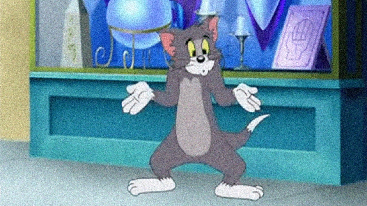

And I really hate to say this because I am a huge fan of Tom and Jerry. I'm fully aware that The Mansion Cat is a "modern" Tom and Jerry, so naturally it wasn't going to be the same. But you do expect and hope that any modern cartoon or whatnot of a classic to actually try to stick to the spirit of that classic. And it was here where The Mansion Cat failed. The good news is that it is not as bad as Gene Deitch's cartoons, at least it isn't sadistic or bizarre. The bad news is that it just wasn't interesting or entertaining for me. For the real deal, I'll stick with the Tom and Jerry cartoons of the 40s and 50s, even the hit-and-miss Chuck Jones output is preferable to this. The animation is certainly bright and colourful, but this is one of those rare occasions where I don't class that as a good thing. The brightness and the colour came across as rather over-saturated, even the Cinemascope Tom and Jerry cartoons weren't as garish to look at, and does nothing to hide the rough and static style of everything else on the visual front. Coming off best is the footage of Muscle Beach Tom, which was interesting, but at the same time I did question whether there was any need for it.The music was a little bit better, it has more life than the scoring for Jones' cartoons and isn't bizarre for that of Deitch's, but again it is nowhere near as catchy, lusciously orchestrated and above all memorable as MGM/Hanna-Barbera's. The story is incredibly thin and predictable, and sometimes read too much of an appliances advertisement which I in all honesty found really weird, when you're checking and re-checking the credits to see whether you're watching Tom and Jerry you know there's something wrong. As said before, The Mansion Cat is a failure in sticking to the Tom and Jerry spirit, the cartoony slapstick and fast-paced chases are next to nil in quality and impact, while there only seemed to be a couple of gags and they were pitiful attempts at best ruined by everything being forced and timed poorly. Tom and Jerry are a classic duo, but they don't feel or act the same here. They have no spark or likability at all, with the humour severely undermining their talents, reading as being there but with next to nothing that is worthwhile to do.All in all, really poor, interesting for being the only Tom and Jerry to have closing credits and for the usage of Muscle Beach Tom but other than that it is not worth wasting your time on. 1/10 Bethany Cox
... View MoreWho told Karl Toerge he was funny? This question will keep me up nights. He and Diana Ritchey, J. Eric Schmidt, Jay Bastian, Andy Lewis, Linda Simensky, Chuck Harvey and Alan Zegler will please keep 1000 yards away from any Tom and Jerry material for the rest of their lives.I can only assume Joe Barbera did his line readings from a reclining position, in bed at his home, after being handed a five-figure check. And then Karl Toerge kissed the feet of the master, backed out of the room reverently, and sped away in his Beemer. Of course, after finishing his work I am sure he made (successful) Herculean efforts to keep Joe from seeing this filmic feces until he died in 2006.This is the anti-Tom-and-Jerry. If you have this recorded, toss it into a lake of fire where it belongs.
... View MoreI had The Cartoon Network on in the background while I was just sitting around, and this Tom and Jerry short caught my attention, obviously being relatively modern. Usually, of course, these attempts to revitalize or even just homage old franchises fails horribly, but this one caught me off guard -- it barely tried. In fact, I believe I counted three actual attempts at gags. The bulk of the cartoon seemed a showcase for those "wacky modern art backgrounds" where the fill colors are misaligned with the outline of objects, every sound effect the director could pull out of his library, and modern appliances (boringly enough). Of course you might recall that the classic Tom and Jerry cartoons often involved household objects from ironing boards to steam presses to refrigerators. So apparently these references to everyday devices were what the creative team behind The Mansion Cat remembered most fondly, so instead of supplying us with the inventive slapstick of olde, they try to impress us with ice-makers, big-screen TVs, VCRs, coffee machines, riding lawnmowers, and wall-mounted fish aquariums. Frankly it looked more like a Sears ad than an attempt at humor. This just compounds the fact that modern cartoons couldn't hold a candle to the old '40s and '50s cartoons pouring out of MGM, Disney, and Fleischer Studios. With the exception of Spongebob Squarepants and the older Dexter's Laboratory, you'd think modern creators aren't even trying, even though they've got the luxury of having an actual paradigm to follow (unlike the creators of the classics). I don't know where the funny cartoonists have gone, but they certainly didn't come anywhere near this one.
... View MoreI thought Joe Barbera was dead before I saw this. I was watching Tom & Jerry on Cartoon Network late one night, and as I was about to turn it off and head to sleep, this caught my attention. I thought "Well this can't be an old one, it's too colorful and bright". So I had to stick around and watch, to see what year it was made in. Sure enough, it was made in 2000. Clearly the director is trying to make it as much like the old one as possible. He even asks Joe Barbera to do the one voice in the short cartoon. But ultimately, the bright colors and knowing the fact that it isn't the old version doesn't allow you to enjoy it.
... View More