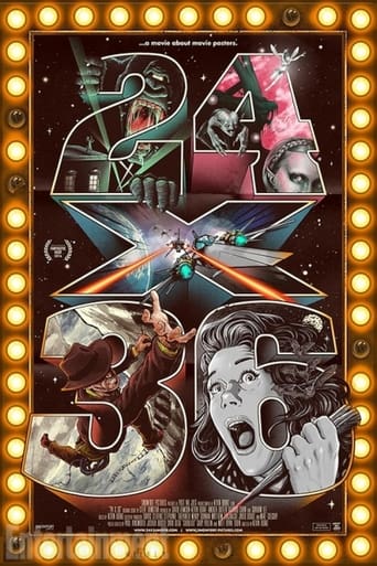

I don't know how this one flew under my radar, because movie posters are one of my many passions, and a documentary about just that very thing would have immediately stuck in my head. But alas, I somehow missed this one. And I'm not entirely sure how I came across it now, but it looks like it was released back in 2016, but I guess it's never late than never. So let's dig in.I think the topic of movie posters, and their ever-changing and evolving style is such a brilliant idea for a documentary. It's a topic that's rarely ever discussed anymore, except when complaining about the prices that any new Mondo release goes for. As for the state of movie posters in general, it's pretty sad, and I know I'm not the only one who really dislikes where they are right now with the big studios. Movie posters used to be an art form, just look at any of them beginning with the 20's going on through the 80's. Each decade offered a different style, but each very much an artistic endeavor, with the work being done in the 80's being a critical and commercial high point. Once we got into the 90's, it all started to change, with photography creeping into the format more and more and hand-drawn or painted artwork going out the window. And it's only gotten worse with Photoshop, where every single new film is either a floating head of the star, or a badly rendered collage of images from the film. Just look at most of Marvel's superhero films. Though I am loving DC's Wonder Woman marketing campaign and their colorful almost art deco approach to her posters, as well as Kong: Skull Island's classic artistic approach.Personally I found this documentary to be highly enlightening, and thoroughly entertaining. It's not perfect, but a very fun way to spend 2 hours of your life, especially if you're an artist or collector of movie memorabilia. For the most part, I really enjoyed it, but I felt that it devoted too much time to the state of modern-day posters today rather than the art and skill of it in decades past. Meaning, a good chunk of this film's running time is pretty much spent on Mondo and other's like it, which is cool because they are the ones who reinvigorated the "hand-drawn movie poster" movement, but I really would have liked to have learned more about the older posters and their artists, which they do touch on early on, but I guess not enough for my liking.At the same time it was interesting getting to see in person the artists that I currently follow, some of who's work adorns my walls, and their thoughts on the current movement and where it's headed. It also brings up an issue that I have with these new posters, and that's the flippers who buy the extremely limited quantities out within seconds and immediately flip them around for ridiculous fee's on eBay in a matter of minutes. I knew I wasn't the only one who had an issue with this and I was glad to hear from the artists themselves how it pretty much makes them sick that some (flippers) are only in it for the money and take so much away from the collectors who just want one to hang on their wall, not for profit. It's good that most new companies out there that do the same thing are mass producing them instead of limited runs of 100 like Mondo, that way anyone can get one if they want. I like that idea.Definitely worth a watch and it's a fun one at that. Just wish so much time hadn't been spent on the current movie poster crisis, and instead focused on the classics and their lasting appeal compared to the over- Photoshopped nightmare we're currently in. But I get it, trust me I do. There's a resurgence and an urgency and art about the movie poster format and it's because of companies like Mondo and others. Hell, I still try to grab one from time to time because some of them are just too killer. One thing's for sure, watching this will definitely get you into wanting to track down some old favorites, or even check out what new artists are doing with them these days. www.robotGEEKSCultCinema.blogspot.com
... View MoreSo I finally got past the title. It's a phenomenally crappy title, given that the standard "movie poster" size is a one-sheet, which is 27"x40/41" The trick is this movie spends way more time focusing on "unofficial" movie-related screen-prints which *are* 24x36, which is a bit of a disappointment. I'd rather they spent more time documenting the history of movie posters and the stories behind those posters, than focusing on some random artists doing unofficial work.
... View MoreA fascinating subject poorly documented.Some horrible audio at least distracts from the complete over use of adobe after effects. Almost all the interviews are unbelievably badly recorded, it almost seems like they forgot to bring a mic and just did it all in camera.Some of the animated posters are a nice idea but it gets old quickly.Still watchable but could do with a few fixes here and there.
... View MoreA documentary exploring the birth, death, and resurrection of the illustrated movie poster.Early on, the film tells us a great truth: posters are often more iconic than any one scene of a movie. "Jaws" comes to mind, as do others, where it is the poster that has become the popular image. And yet, do any of these names sound familiar: John Alvin (1948-2008), Bob Peak (1927-1992), Reynold Brown (1917-1991), Richard Amsel (1947-1985), Drew Struzan (b. 1947). Probably not, though they were the giants of the poster art world.The studios saw the posters as advertising, not art. And while that is true in the strictest sense, it left many great artists unappreciated. More often than not, no signatures were allowed on the posters, and the work from the earliest years in now anonymous. Who painted the great posters of Frankenstein's monster? We will never know.As anyone who lived through the 1980s-1990s knows, in the late 80s, there was a shift to photography, with the idea that artistic posters might suggest an animated film. This claim that pops up again and again, and sounds absurd on its face, but one scene actually has a focus group looking at posters and making the exact same comment.The "art" in poster art took a dive in the 1990s, leaving us with "floating heads" and the same layout was used over and over again. For horror fans, this was evident in the teen horror films ("Scream", "Last Summer") and has not really stopped. Even the more creative posters today seem to rehash the same poses and images over and over and over. Is poster art dead? No. Because "24x36" covers a longer history, a new trend. Not just the history of lithographs and the decline of posters, but its new resurgence thanks to the rise of Mondo, its eccentric leader Rob Jones, and the new art from specialty Blu-ray labels like Scream Factory and Arrow Video. And this generation of artists, such as Gary Pulling, are not anonymous."24x36" is a much-needed piece of film history. There are many biopics, and there have been focuses on the special effects. Those behind the scenes are finally getting their due. But what of the painters and sketch artists who really drove the images into our collective, pop culture imagination? Now their story can be told!
... View More